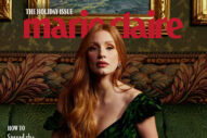
I really do not like this. At all. Let us count the ways.
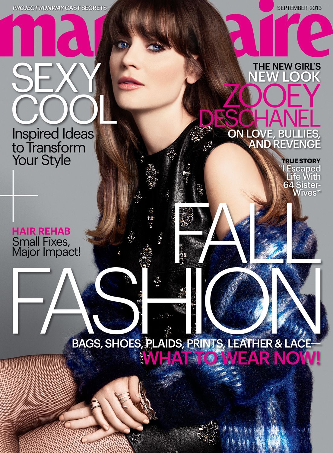
1. Why are all the cover lines encroaching on her face, when there’s all that empty space at the bottom? Can’t we just scoot everything down a wee and let her breathe?
2. Was there an actual printing error? This cover looks like the person who laid it out was hammered. Why is the plus sign all the way over to the left, like it’s cut off?
3. And why is that stupid plus sign so much bigger than “I Escaped Life With 64 Sister Wives”? That should be bigger. THAT IS A LOT OF SISTER WIVES.
4. Why does Zooey Deschanel have Kristen Stewart’s facial expression?
5. That angle and that glare aren’t doing her loveliness justice at ALL, and they don’t really make me want to hang out with her for the duration of a magazine article.
6. Seriously, she doesn’t have to be cheery all the time, but I don’t think “Surly Zooey Deschanel” is tops on the list of things people want to see in the world.
7. Nor is Hunchback Zooey Deschanel, and yet here she is, too.
8. The Hunchback of Notre Deschanel does have a nice ring about it, though. THAT article, I might have paid to read.
[Photo: Marie Claire]