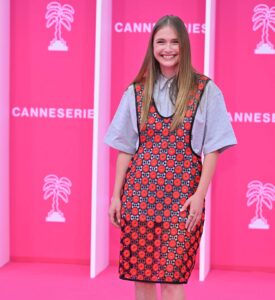

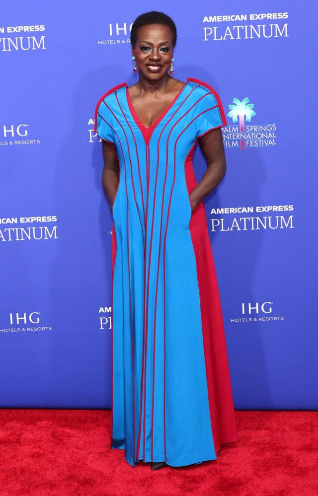
Earlier today, while I was reading coverage of the ongoing Congressional dipshittery, I noticed a story in the corner about Viola Davis and Julius Tennon doing a big home spread for Architectural Digest. She looks smashing in a black and white dress that, it appears, is the exact same one she wore last night to the Palm Springs Film Festival opening — but in color. I have to think shot that just long enough ago that she wasn’t thinking about the magazine release date, or the possibility of them both debuting on the same day seen on roughly the same day. Not that it’s a catastrophe. She must have loved it and wanted to try them all, which is a very relatable impulse. I was always the person who would find a shirt I liked and then buy it in a few different colors. At times, it backfired and the fit wasn’t the same, or the second (or third) hue didn’t sing, but occasionally it worked out. Is this working equally? I can’t tell, with the caveat that we are comparing two good things and there is no loser here. You know I love a bright shade, but I MIGHT be leaning toward the first version. Partly, I think, it’s the styling; the matching electric blue eye shadow in the corners of her eyes isn’t entirely flattering. But the black-and-white just looks so crisp. And maybe the red and blue feel less harmonious to my eye? It’s hard to compare two totally different contexts and lighting setups and whatnot, though, so I will kick it to Fug Nation rather than lowering the gavel prematurely. Perhaps whichever answer wins can become Speaker of the House?