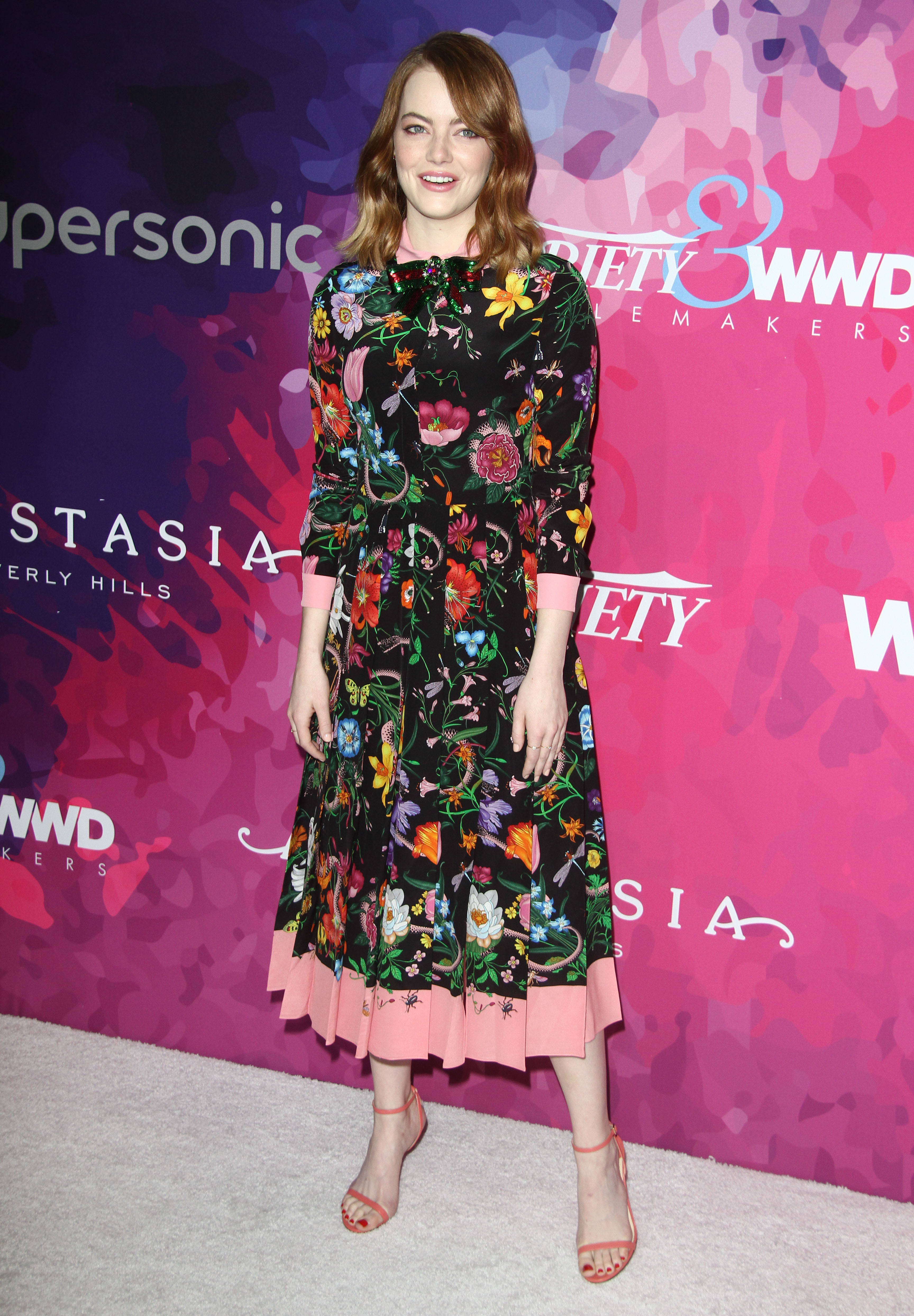


Hello, Fug Nation! You look foxy today. Wait, what am I saying? You’re foxy every day. The Rock agrees.
As promised, we are now on the other side of our mild re-design. We also know not everything is going to work perfectly in the first week — there’s already a list of bugs — so we’re very much hoping you’ll bear with us as those get ironed out, and also, that you’ll report anything in the comments of this post so that we can make sure it gets added to the list.
We know you’ll have a couple questions, and here we’ll try to anticipate some of them. I’m sure a big one is:
1. “WHY GOD WHY???”
We addressed some of that here. The short answer is that technology and the Internet marched on, and we were bringing up the rear of the pack; the longer answer is that the huge reason we still exist at all is that we have a partner that hosts our site, handles the tech support, and does everything with ads, and that company had certain stylistic and back-end needs we needed to meet. Much like how Gawker Media sites had/have the same basic template, so too do Spin Media sites, of which we are one (affiliated, not owned; that’s been erroneously reported before and it chaps my hide so pardon me for clarifying, but: I’m clarifying). We were the lone holdout on that new template, and it was making tech support and hunting down rogue ad issues a lot slower, in addition to affecting our load times. Ideally, that will all be smoother (and if not, please always let us know at [email protected], or — for this week at least — in the comments of this post).
It’s not going to fix or eliminate the jerks who try to sneak in offensive redirects; trust me, if I could eliminate those pantsmaggots, I would. *shakes fist* But it OUGHT to help misbehaving pop-ups, and make it easier for the tech folks to hunt those down and tame them.
2. But I can’t still see whole photos, or read whole entries, on the homepage! I liked that. Now I have to do so much clicking.
I get that. We were, again, fairly uncommon in cleaving to that design for as long as we did, and it’s because we’re traditionalists and we liked it too. But over the years, we actually did get a LOT of complaints from people that it a) made it a longer process to sort out what was new to them and what wasn’t; and b) made it very arduous and annoying to scroll past stuff they didn’t care about, like recaps of shows they don’t watch, or royals coverage if they’re not into that, or the Kardashians. This way, you can take more of an at-a-glance approach to reading the site. And if you want to read ALL of the new posts, which obviously I hope is the case, one shortcut is to do what I do: click into the newest entry, and then at the bottom, use the “previous post” link to leaf back to the next newest post, and so on and so forth.
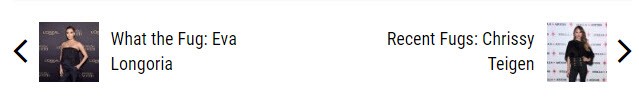
They’re very cute now. I like those thumbnails. PLEASE NOTE: They’re currently in the opposite spot they should be. That’s one of the bugs on our list. To my mind, “previous” should be on the LEFT, not the right. WE’RE ON IT.
3. Harumph. You just want clicks.
Honestly, no. I mean, yes — the reality of being a small business on the Internet (or even a large one), is that to some degree you are beholden to The Almighty Pageview. But that’s not why we did this; it’s not why we’ve done anything, actually, which you could argue might be why we’re still a small business on the Internet. We had the option to switch to this design in 2010 when we did THAT redesign, and we stubbornly didn’t. It took the intervening six years for us to realize we were even bigger dinosaurs than we thought, and that there are in fact advantages — for readers — to having more content visible on the homepage. Before, it was six new entries. Now it’s way more, plus different spotlighted archives you can visit.
4. How do I read the captions on the slides?
Keep scrolling down! They will magically pop up. It’s sorta slick.
5. Some of the photos look sized wrong.
Yep. That’s a bug that’s being ironed out WE HOPE.
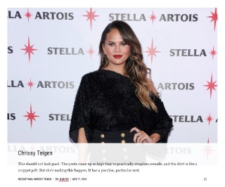
6. I want to see the high-res full-size photo. But “view full size” and “view original” are gone. HELP.
They’re not gone; they’re just different-looking. Allow me to show you.
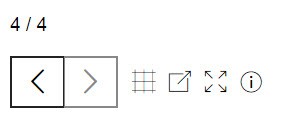
Those graphics, you’ll see to the right of the photo. The arrows are how you navigate the slides, obviously, but you can ALSO use arrow keys on your keyboard if you prefer. The box with the arrow poking out diagonally opens the photo alone in a new window. The the box with the FOUR arrows in it opens the full-size version of the photo, and the circle with the “i” inside brings the caption up immediately. (I kinda like the gentle arrival via scrolling, but not everyone will.) You can also just click on any photo that you’d like to see ENORMOUS, which I just discovered on accident.
As for the little grid button, that’s how you pop out to a grid view of the thumbnails of every picture in the slideshow. Like so:

7. The last slide in a slideshow, the one that points us to another slideshow, seems to have a photo caption that it shouldn’t.
It does indeed. On the list. We thought it was already fixed, but you know.
8. And how do I get back to the post, from the end of a slideshow? I want to leave a comment.
Look up on the top right; you should see a thumbnail and a Return to Story link Like so:

9. What’s the featured gallery thing on the homepage all about?
It’s a break in the programming to be like, “Hey, check out other stuff you often like.” We can rotate what they are; for example, come Golden Globes time, we might make it link to our Globes archive, or even one from a specific year. There’s also, somewhere underneath that first featured gallery but on the right sidebar, a This Fug In History unit that unearths something from the depths of our archives that we wrote on or around the current date.
10. I miss the photos in the old masthead.
Me too. Those were fun. But the template sadly didn’t allow for keeping the sassy headless photos. It did, however, give us the dropdown menus — better ways to find recaps, royals, awards coverage, and Kardashian and non-Kardashian WTF posts — and we think long-term you’ll like those better.
We also got a prettier carousel of spotlighted stories — stuff that’s not the newest, but which was popular, or can’t-miss. It’s basically our Hot Right Now bar, but nicer, and without those weird little matchsticks. It shows two stories, but you can use the arrow to cycle through to two more.
11. The mobile site is doing weird things at the end of slideshows, among other things.
Yeah, that’s a combo of a bug and a new feature. We call it a jumping-off page, and it means that at the end of a gallery, it suggests a new slideshow for you to peruse. Right now, some of the slideshows promise you have one more photo when you actually are at the end; we’re fixing that. Also! On mobile, when you scroll down, as of this second you might get suggestions to peruse stories from around the internet that might seem saucier than you excepted — we are also fixing that ASAP. (I think it’s just accidentally set to another site’s preferences.)
And so, here we are. Not a ton has really changed, maybe because it didn’t need to, or because we didn’t have the chance yet. Again, please keep letting us know if something’s not working, and we’ll try extra hard to stay on top of those comments, and thanks for your patience as we work out the kinks.
PS: Just so you know, Friday’s postings might be a little off schedule while we deal with our new content-management system, but hang tight. If we aren’t back to normal yet, in terms of how often we post, we will be very soon.