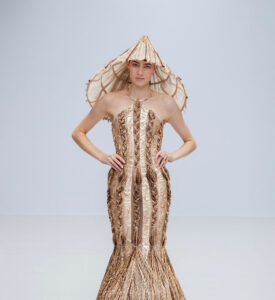
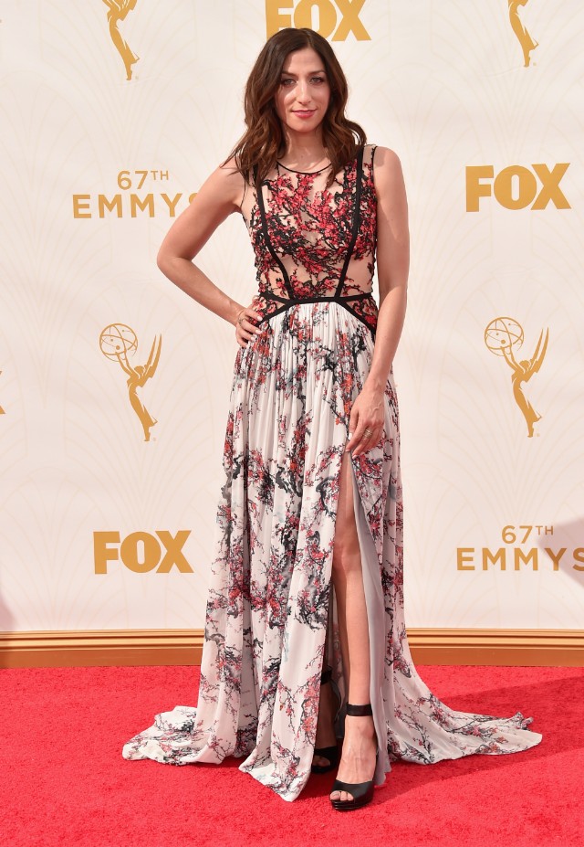
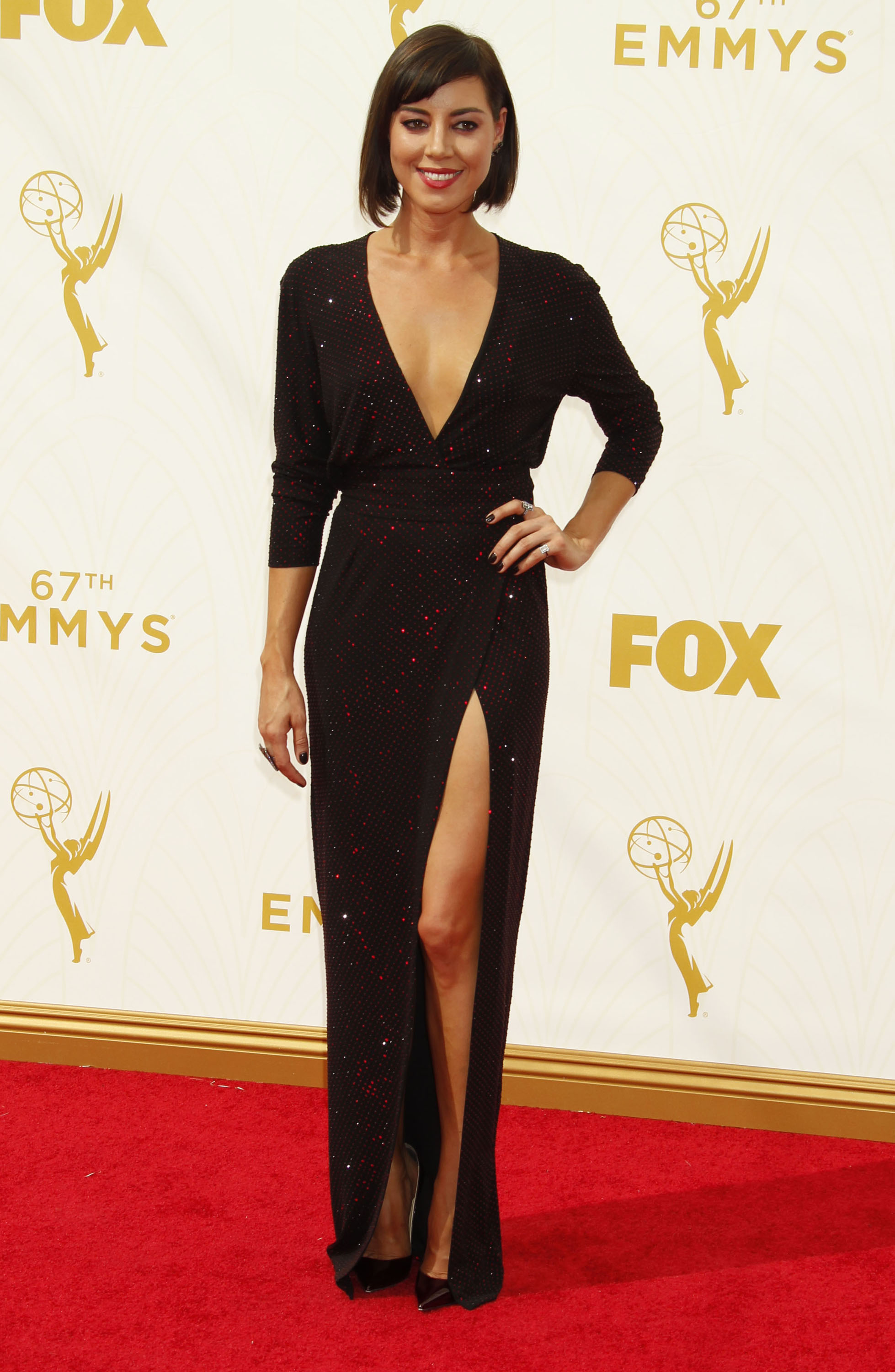
If this looks familiar, it’s because Lorelei Linklater wore its brethren to the Oscars.
Chelsea’s version is better to my eye, because it’s more fluid (Lorelei’s looked like student work, by someone who hoped to be chucked out of the program). But it’s still something of a mish-mash. I’m sure the whole motif is supposed to evoke a lovely blossoming tree, or something, but somehow — even with that theme clearly present on both top and bottom — the two still feel like they clash, or as if the top is what you’d get if you ate the top and expelled the waste. It feels weirdly aggressive and lacking in romanticism for something that may fancy itself a tribute to spring foliage.Help.
Whose was more palatable?
- Lorelei's (5%, 156 Votes)
- Chelsea's (61%, 1,895 Votes)
- Neither -- I just cannot (33%, 1,031 Votes)
- BOTH, so there. (1%, 39 Votes)
Total Voters: 3,121
