


Who Fugged It More: Kate Winslet, or… Kate Winslet
You might remember this dress from the Mildred Pierce press tour, and how much I hated it, and how a lot of us thought it made her chest look like a preying mantis. The prevailing sentiment was that people wanted to see it in different colors, to determine what the problem was: the blocking, or the garment itself.
Kate heard your pleas, Fug Nation. Or else she made those same pleas herself.
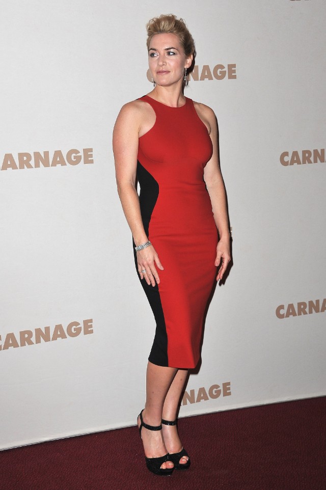
It is definitely better in red. I find the shoes to be clunky and forgettable, ditto the hair, and maybe she needs a redder lip here. But the dress itself, streamlined to one bold color and then the black detail, seems to be doing exactly what its intent was: flagrant public bodaciousness.
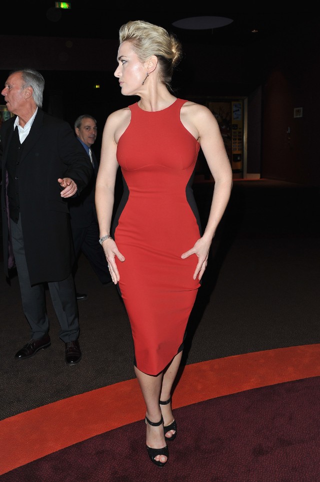
ESPECIALLY when you view it against the background of darkest night. It’s totally slimming and va-va-voom, but not in a way that has me afraid her midsection is going to end up on the Discovery Channel.
Which version do you prefer?
- The red, by far (80%, 8,451 Votes)
- The beige and white, by far (2%, 254 Votes)
- It's a coin toss (3%, 350 Votes)
- It's a mess either way (6%, 657 Votes)
- "You and me, baby, ain't nothin' but mammals, so let's do it like the do on the Discovery Channel." (4%, 475 Votes)
- THANKS A LOT FOR THAT EARWORM. Jerks. (2%, 242 Votes)
- Hee. (2%, 170 Votes)
Total Voters: 10,600

[Photos: Getty]
Jump to comments